In this guide we are going to explore how to integrate Sass and external CSS libraries or frameworks into your Stencil workflow.
You can use any styling framework of your choice, but for this guide we chose to use Bulma.
Bulma is an easy to use, easy to customize, pure CSS framework. Pure CSS means it requires no JS *at all. *That makes it very easy to integrate with Stencil.
Step 1: Initialize Stencil
npm init stencilIf you wish to follow along with this guide, when prompted chose the option components and name your project stencilbulma.
cd stencilbulma
npm install
You can have a look at their documentation for more information. Click here.
Step2: Integrate Sass
Install @stencil/sass:
npm install @stencil/sass --save-devRename your my-component.css to my-component.scss. Update the styleUrl in your my-component.tsx:
import { Component, Prop, h } from "@stencil/core";
import { format } from "../../utils/utils";

@Component({
  tag: "my-component",
  styleUrl: "my-component.scss",  shadow: true
})
export class MyComponent {
  [...]
Populate the renamed file with some Scss:
div {
  color: red;
}
Edit stencil.config.ts:
import { Config } from '@stencil/core';
import { sass } from '@stencil/sass';
export const config: Config = {
  namespace: 'stencilbulma',
  outputTargets: [
    {
      type: 'dist',
      esmLoaderPath: '../loader'
    },
    {
      type: 'docs-readme'
    },
    {
      type: 'www',
      serviceWorker: null
    }
  ],
  plugins: [sass()]};
Start your project:
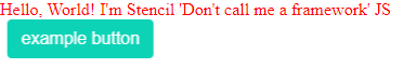
npm startYour Sass compilation is now working and you should see your initial Stencil text shown in red:

Step 3: Add Bulma
Now that you have the Sass compiler up and running, it is very easy to add other Sass based libraries into your project with @import '/path_to_node_modules_files'.
npm install bulma --saveEdit my-component.scss to look like so:
@import '../../../node_modules/bulma/bulma.sass';div {
  color: red;
}
Then add an example Bulma component inside your render function in my-component.tsx:
[...]

render() {
  return (
    <div>
      Hello, World! I'm {this.getText()}
      <button class="button is-primary">example button </button>     </div>
  );
}

[...]
And voila!
Conclusion
It is very easy to integrate Sass/Scss into your Stencil workflow. After it is all setup, importing additional libraries into your web components become a breeze.
Here are a few general (not caused by Sass/Scss) concerns that are not covered in this guide. These topics may get their own articles in the future:
- Shadow DOM CSS is not minified by Stencil out of the box.
- Children web components do not inherit styles from parent. Styles get duplicated in each shadow DOM.
Hope that helps! Keep reading for some cool tips bellow!
Bonus Tip 1: Modular Imports
One great feature of Bulma is its modularity. If you want to keep your components small, you can import only the necessary files. Back in my-component.scss try the following:
@import '../../../node_modules/bulma/sass/utilities/_all.sass';@import '../../../node_modules/bulma/sass/elements/button.sass';div {
  color: red;
}
When your component reloads, it will look exactly the same as before, but your imported css will look much leaner.
Bonus Tip 2: Bulma Customization
We mentioned earlier that Bulma is very easy to customize. If we wanted to change our theme color to yellow we could edit my-component.scss:
// import helper functions@import '../../../node_modules/bulma/sass/utilities/_all.sass';// set desired variables BEFORE importing Bulma$primary: yellow;$primary-invert: findColorInvert($primary);
// import Bulma as usual
@import '../../../node_modules/bulma/sass/utilities/_all.sass';
@import '../../../node_modules/bulma/sass/elements/button.sass';

// other styles
div {
  color: red;
}
Bonus Tip 3: Animations
Bulma is great, but being lean means it does not come with many animations out of the box.
We can easily add some thanks to animate.css.
npm install --save animate.cssJust like Bulma, animate.css also allows you to import only the necessary animations. In your my-component.scss add:
// import only necessary animations
@import '../../../node_modules/animate.css/source/_base.css';
@import '../../../node_modules/animate.css/source/_vars.css';
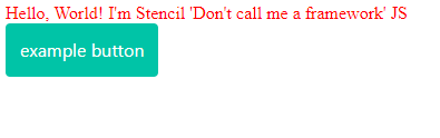
@import '../../../node_modules/animate.css/source/fading_entrances/fadeInRight.css';In my-component.tsx add some animation classes to the button:
[...]
render() {
  return (
    <div class="">
      Hello, World! I'm {this.getText()}

      <button
        class="button is-primary
        animated fadeInRight slow infinite">        example button
      </button>
    </div>
  );
}
[...]
And here is the animated result: